We all know that CSS positioning can be confusing sometimes. When you design a layout, you think about how you position your elements and the surrounding elements. However, there are few ways to design your web layouts, and CSS position property is one of the options.
This post aims to explain it in a way that it's easy to understand. In other words, explain it in a way that a 5yo can understand it 😄
Let's take a simple analogy and go through the CSS position property.
Packing and positioning
Imagine that you are packing your backpack to go somewhere. How do you pack your items? If you drop everything inside the backpack without packing one by one, everything will have its own position in the backpack automatically without you assigning it. But, if you position the way you want and pack everything one by one, you assign them a dedicated position inside your backpack.
Now let's think that a web page is your backpack, and elements on that page are the items in your backpack. So how do you position your elements on this web page?
Normal flow
Before going into details, let's see how these elements automatically get their position on your page. To understand this, you need to understand the normal flow of the web page. Normal flow is how the elements are arranged on a page if you haven't changed their layout.
If you add items to your backpack without arranging them, the items automatically position themselves inside based on the space available. On a web page, the same thing is happening. When you add elements to a web page, they will arrange themselves based on the rules defined by the normal flow.
There are two types of elements on a web page. Block-level elements and inline elements.
Block-level elements such as<h1>, <div>, <p> are contained on their own line. Because block-level elements start with a line break, two block-level elements can't exist on the same line without styling.
Inline elements such as <a>, <img>, <span> don't form their own blocks. Instead, they are displayed within lines. They line up next to one another horizontally; when there isn't enough space left on the line, the content moves to a new line.
Now let's see how we can change and manipulate these positions in CSS.
CSS Position property
CSS has a property called position that helps us change and move the items we want. There are 5 values in this position property.
- Static position
- Relative position
- Absolute position
- Fixed position
- Sticky position
Let's see some simple examples to understand each of these properties.
Static position
The static position is the default or "normal" positioning. So, for example, if we take the backpack packed without carefully arranging it, the items inside take a default position.
On a web page, if you have 3 elements added to the page with static positioning, It will take the normal flow of the page. So any changes to the top, right, bottom, left, or z-index properties won’t make any difference.
Let's add some items into your backpack and see how it would look like with static positioning.
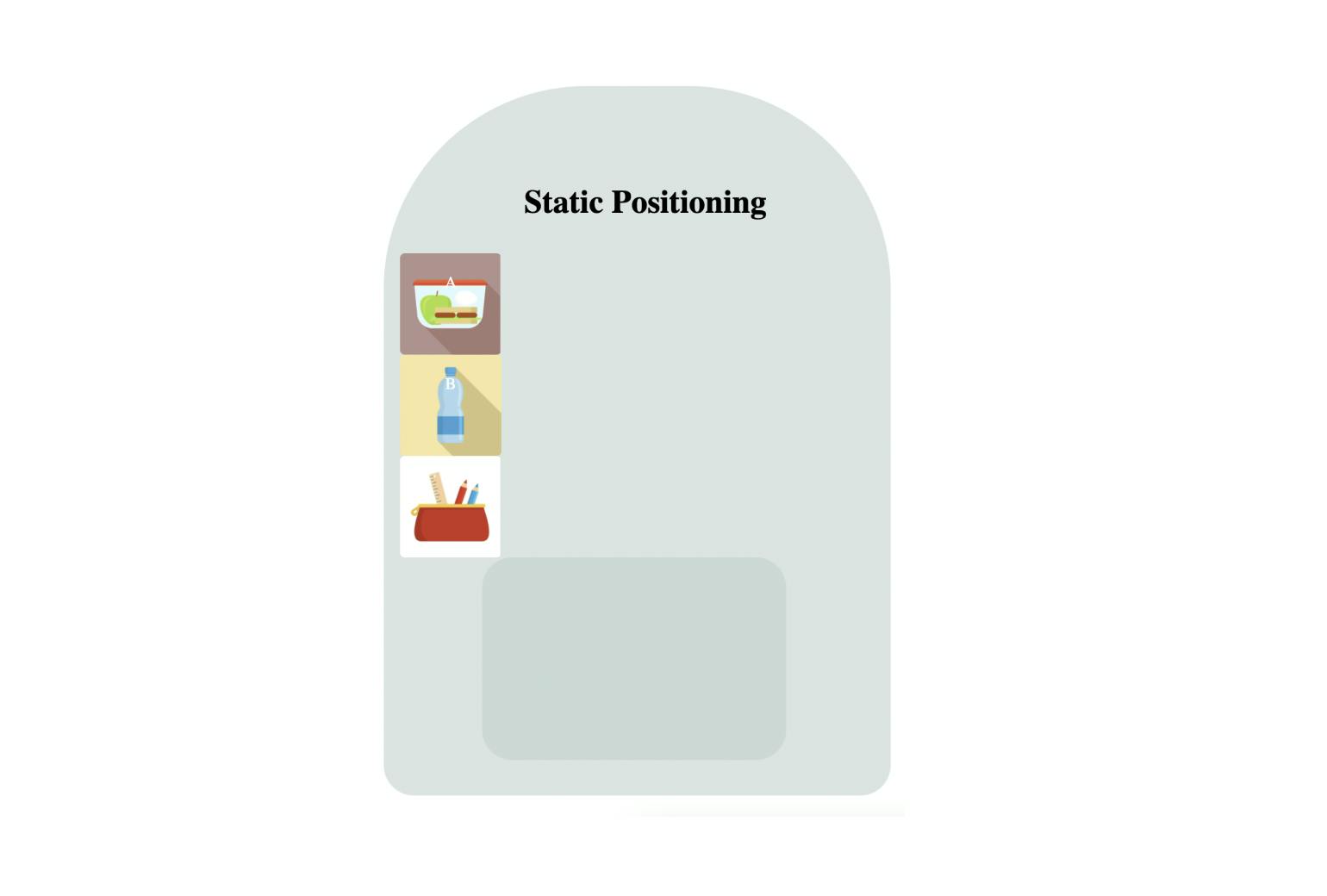
In the above picture, you can see that items in the backpack are arranged one after another. This is because each item's position value has been set as static which is the default value. It is automatically arranged according to the normal flow.
Let's move on to relative positioning.
Relative position
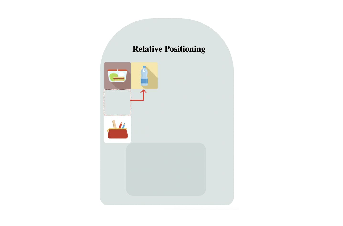
The relative positioning tells your item to move relative to its current position. So, for example, if you want to move your water bottle next to the lunch box, you have to assign the position as relative and give relevant values to move next to the lunch box.
When you move the bottle next to the lunchbox, the position it originally occupied is blank because the pencil case has not taken that place just because you moved the bottle.
In relative positioning, when you change the position, the original space of the specific element will not remove from the normal flow.
If you look at the below picture, you will see that the bottle has moved next to the lunch box, but the original space remains blank because it will not get removed from the normal flow.
Absolute position
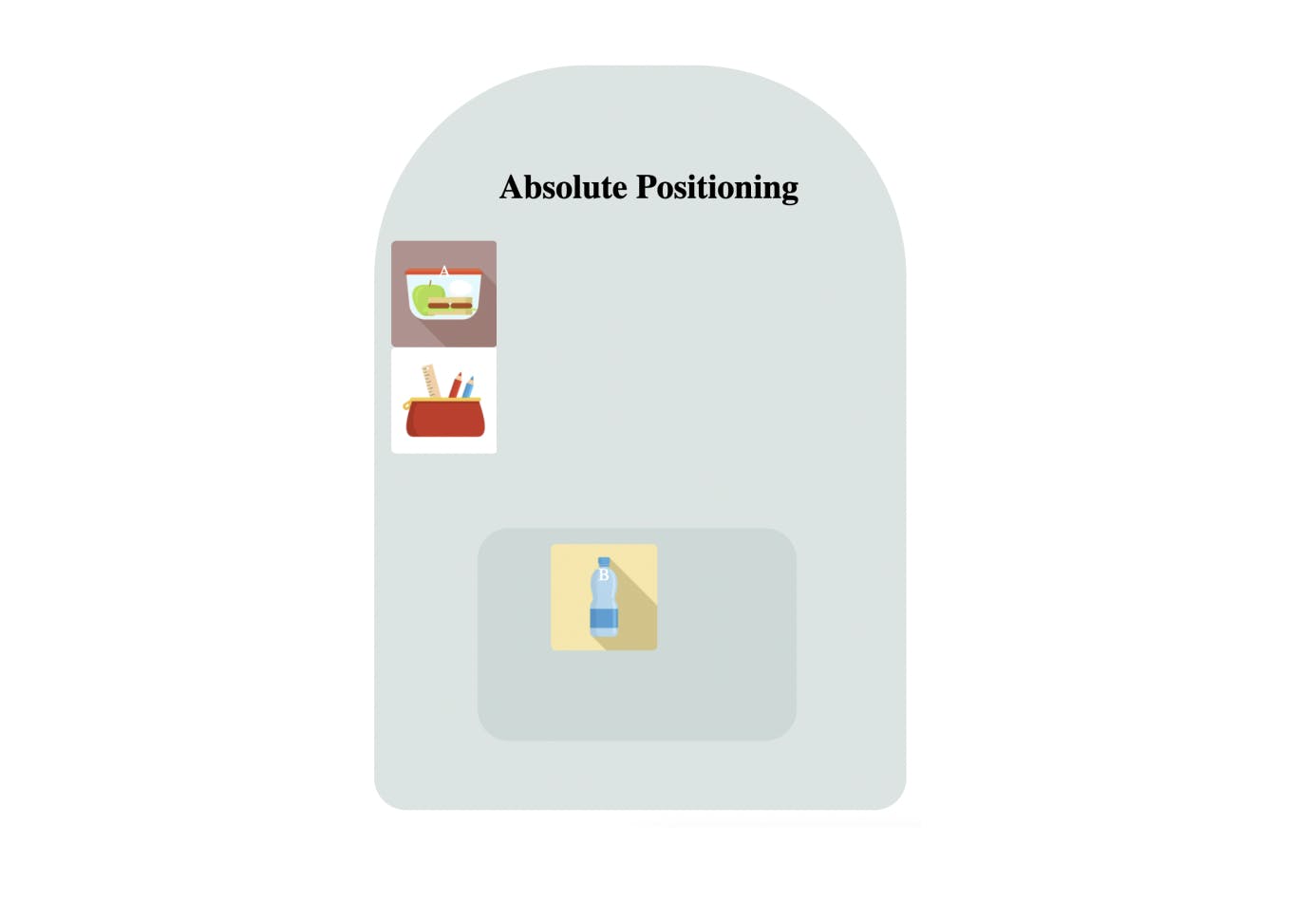
Now, this is a tricky position to explain with our example. Let's say that you want to put your water bottle inside the pocket of the backpack. If so, this pocket should have a relative or any other position, other than static position, already assigned to it. So we can place it inside the pocket in an exact position. And this position is decided relative to the pocket.
If the pocket doesn't have any position assigned to it other than static, and if there are no other nearest items or places assigned with a non-static position, it will move to the top right corner of the backpack. That means it will position itself relative to the backpack; then, you can assign an absolute position based on where you want to place it.
Simply, it means that the parent element must have a position property value other than static for the absolute position to work. If there is no element with a position property value, the element will be positioned relative to the viewport.
When you assigned an absolute position to an element, it removes from the normal flow, the space that the element was originally occupying is no longer there.
Check the below picture. Now your water bottle has an absolute position inside the pocket. Also, the pencil case has moved to your bottle's original space.
Fixed position
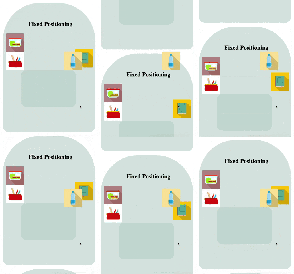
Fixed positioning is like placing your items where ever you want, regardless of whether there are items in that place or not. So, for example, let's say that you moved your bottle to the right side as in the picture below; if there is another book there, you can still place it over there and decide whether you want it on top of the other item, or under it.
When you assigned a fixed position to your element, it removes from the normal flow as well. And it is positioned relative to the viewport. So when you scroll the page, the element remains in the original location of the page.
Sticky position
This is also a tricky position to explain with this example. Now again, I have to scroll your backpack and treat it as a flat surface to explain this 😄
As the name says, it means that you stick your item into a particular place. So, for example, if you stick your bottle on top of your backpack, it will stick in that particular position in your backpack when you scroll up and down the backpacks.
The behavior of sticky position is a combination of relative and fixed positions. Simply, inside the backpack, it will act as a fixed position and not move. But when you scroll to the second backpack, it sticks with the first backpack and moves relative to it.
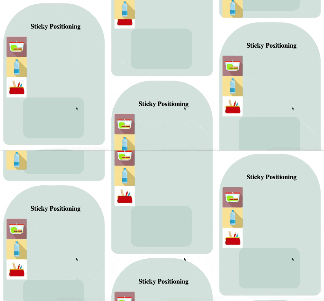
Did you notice how it sticks on top of the backpack when it moves?
Alright, I hope you understand the different values in position property and how those behave.
There's one more concept that you need to understand when you are working with positioning. That is z-index. Let's see what it is all about.
Z-index
Did you notice what happened when we assigned a fixed position to your water bottle and moved it to the right side, on top of the book? How did we move it on top of the book?
This is where the Z-index property comes in. When you have elements overlapping, we use Z-index to stack them.
Let's say that you have a pile of books that you need to stack. So you give each a number and stack one by one. The highest number is on the top, and the lowest number is at the bottom of the pile.
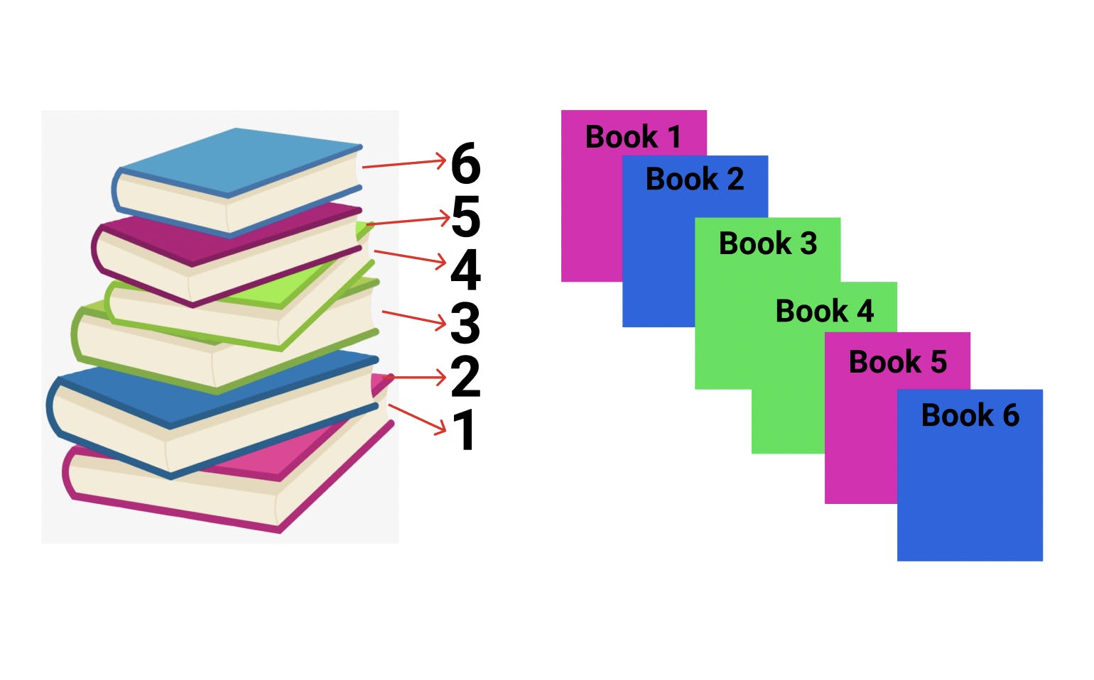
Z-index helps you to stack the elements the same way we stack these books. Any element that has a position value other than the static position can use the z-index property.
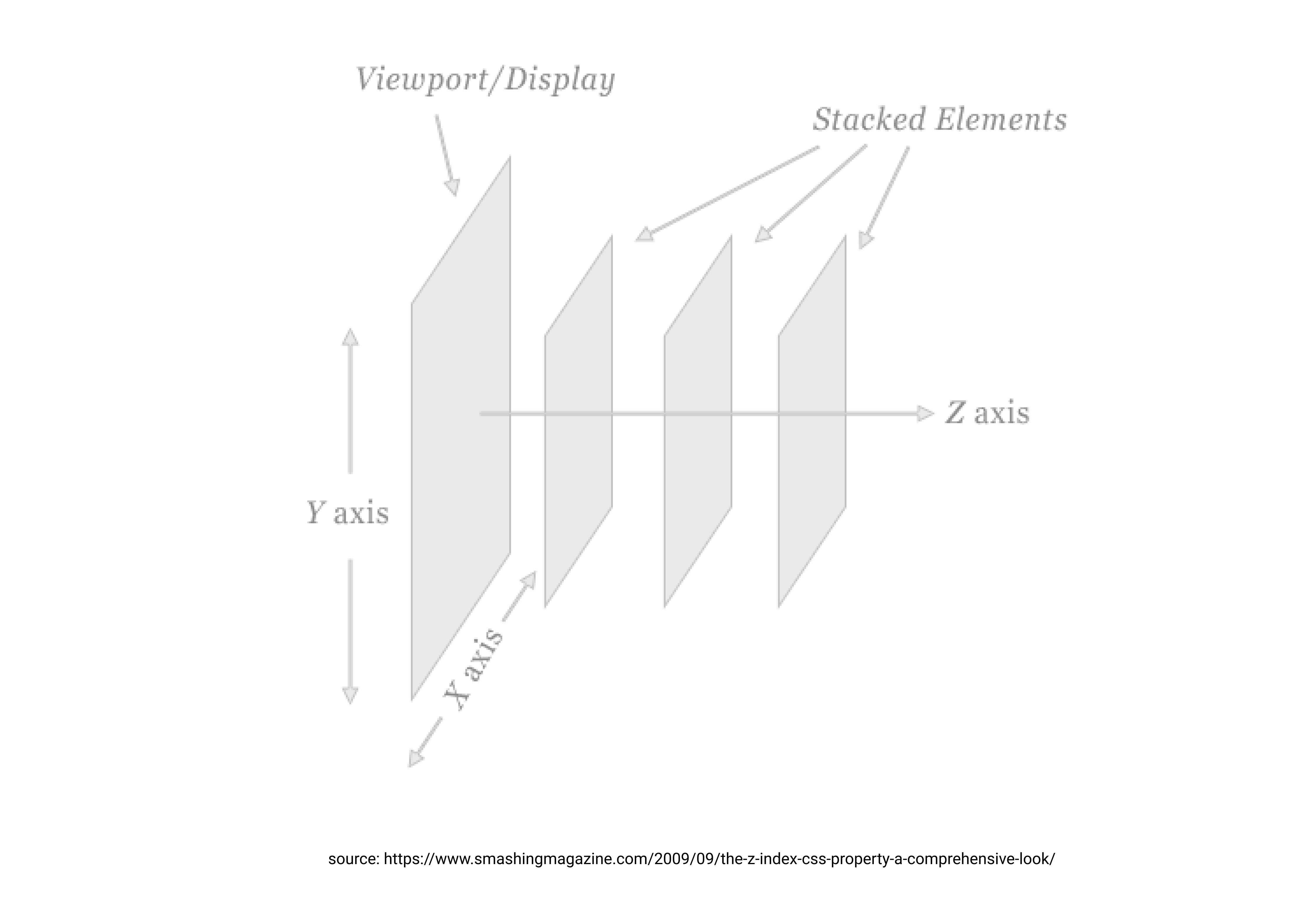
The z-index gives you the ability to decide how the elements should overlap each other, in which order. If you give a higher z-index value, that particular element will appear closer to the viewer. In other words, it will appear on top of the other elements.
So now we have learned everything about CSS positioning. I hope this helped you to understand these concepts in a better way. Don't forget to share your feedback; I would love to hear your thoughts 😊
